Visual identity for Frøs Sparekasse
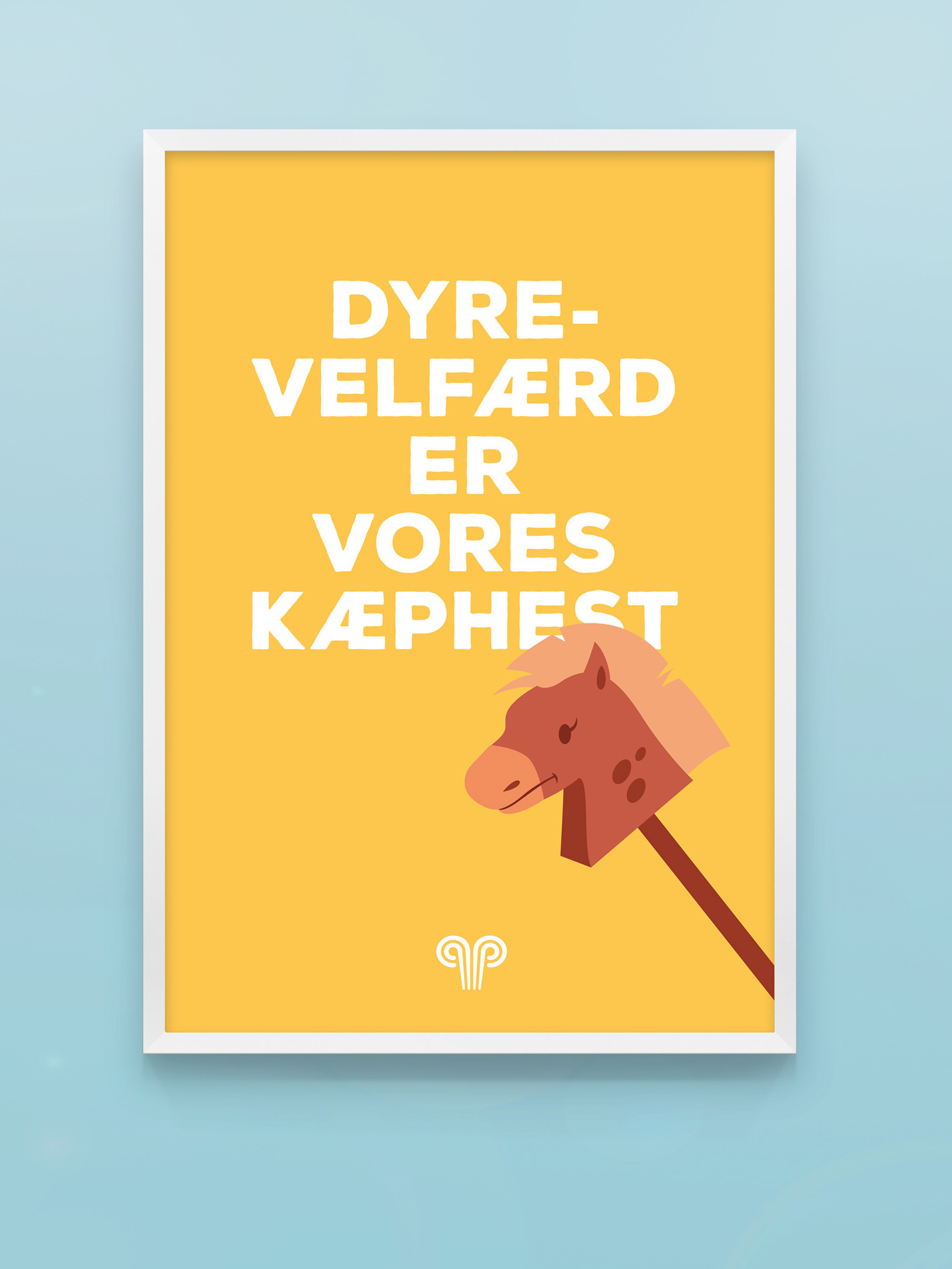
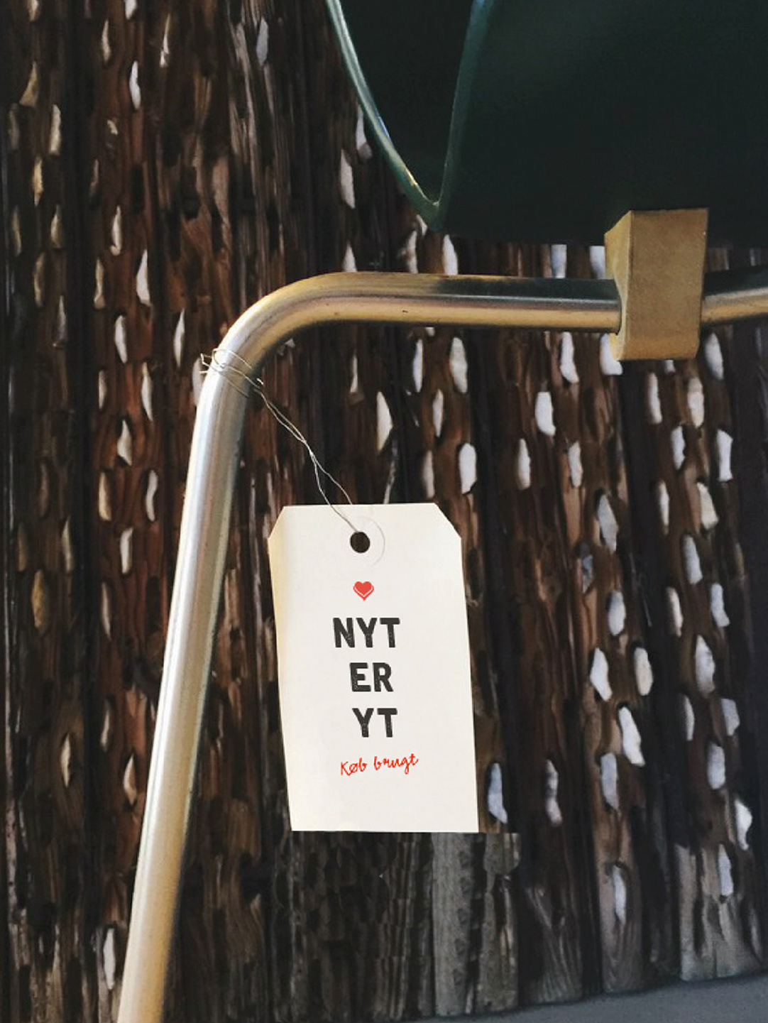
Sometimes you get the privilege to work with both your dream customer and a dream assignment. This was one of those times. Frøs Herreds Sparekasse was in a situation where their brand needed to be lifted and strengthened. They needed an examination of their entire communication package: Brandplatform, DNA clarification, tone-of-voice, visual identity, communication universe – and even the name was in play. After a successful pitch an insightful period started with workshops and needs assessment. A brandplatform was created and the need for Frøs to ‘become more themselves’ was established. Specifically, in addition to the brand platform, a new name, a new logo, a new tone-of-voice and a new visual identity were developed - as well as an activation of their promise # etgodtstedatvære and a deactivation of their payoff "free as a bird".
You may also like
